 mystifying oracle
Tuesday, May 16, 2006
Octopus Press
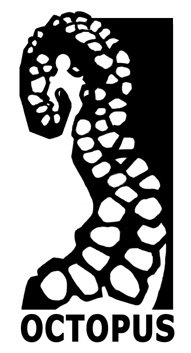
As you may have heard me gripe before, I really wrestle with logos and usually barely get out alive after a bout of creating one. I was never crazy about the original Octopus logo that I used on The Interman, but I ran out of time to keep destroying it. Since the Toth book is coming up, I felt I absolutely HAD to solve the logo dilemma because I'm printing a book featuring one of comics greatest designers, and this tangly cramped image was going to be even more out of place. I'm not going to stick my bad design up, if you want to remember it click over to theinterman.com, they're all over the place there. Since there are other companies called Octopus, one of the first things I did was look at everyone else's logos, which were all generally lame. Unfortunately that put me on the track of trying to make a better looking octopus shape, instead of paring down like you should do with book logos. So it's taken me three years to realize, "I don't have to draw a whole octopus!" and have gone with this single tentacle design which should also work better for the book spines as well. And I only lost a few pints of blood!
![]()